Redesigned a fragmented web experience into a unified system built to move fast
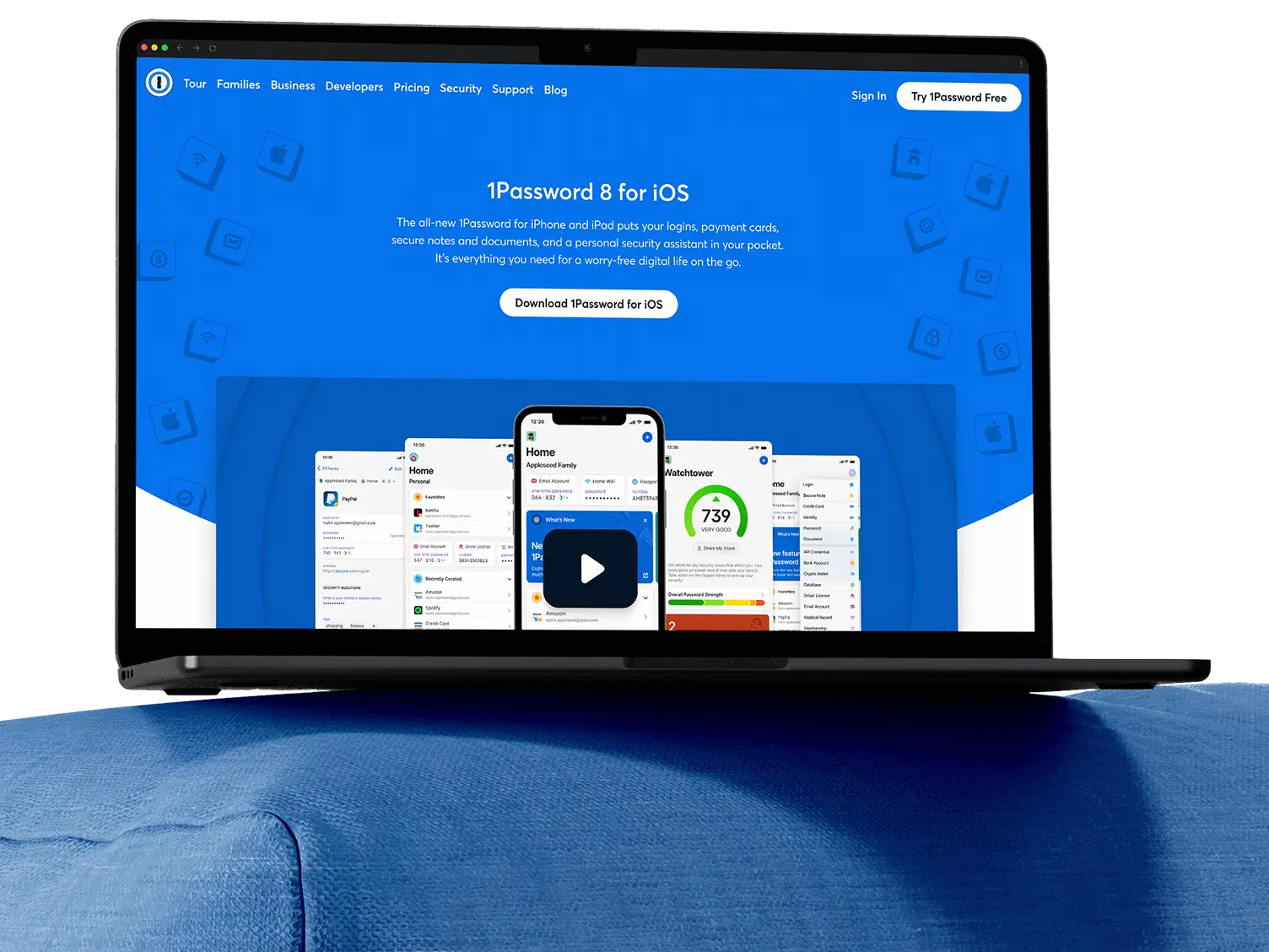
When a SaaS company needs to attract bigger customers without alienating their existing base, the website often becomes the bottleneck. That was the challenge 1Password faced as it shifted strategy to move upmarket and target enterprise customers. The brand system was fragmented and struggling to scale, while the site relied on abstract illustrations that failed to demonstrate how the product actually worked. The site featured inconsistent messaging across audience segments and lacked the credibility needed to close enterprise deals. Without a major overhaul, the site would continue working against the business strategy rather than supporting it.
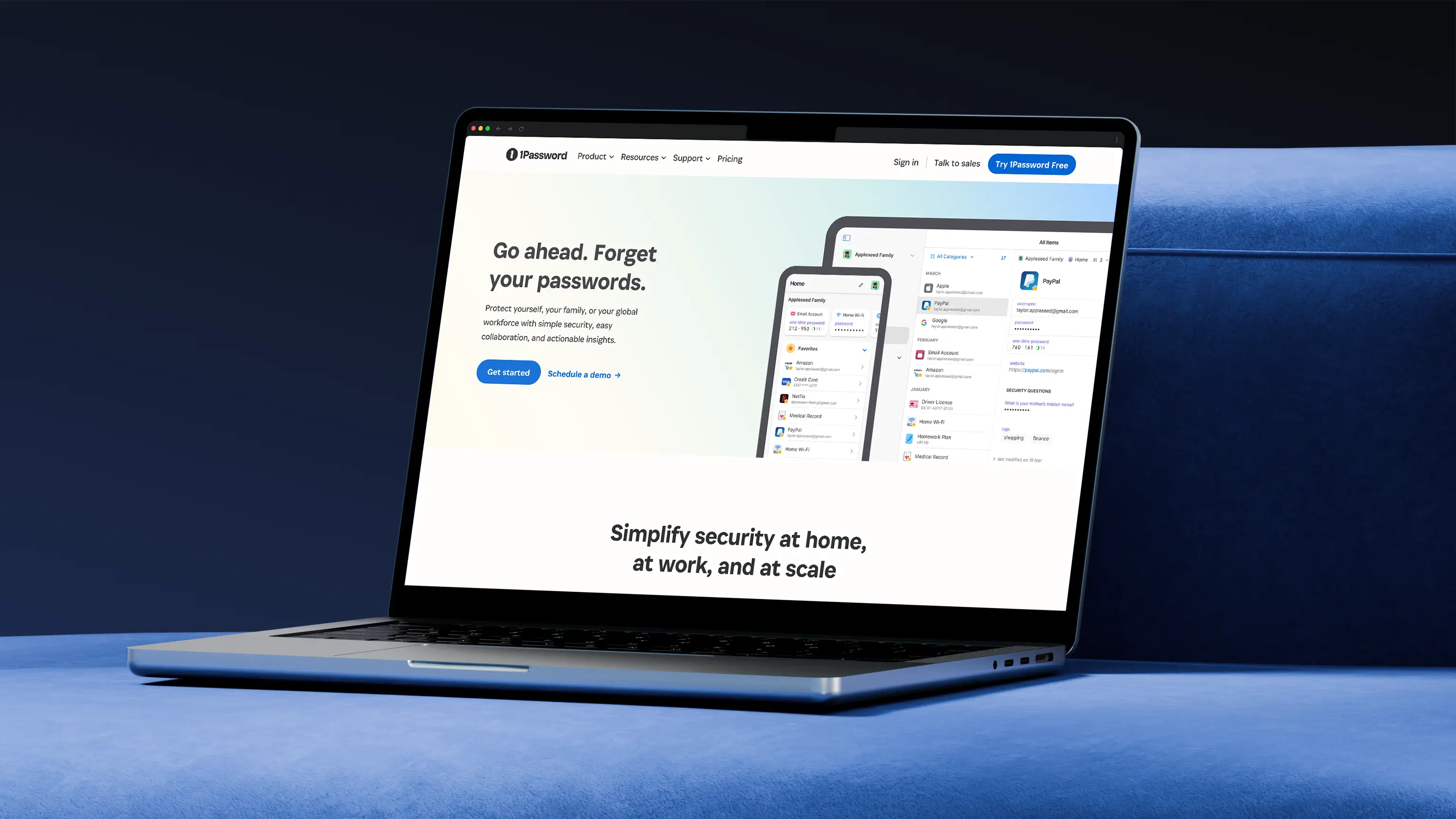
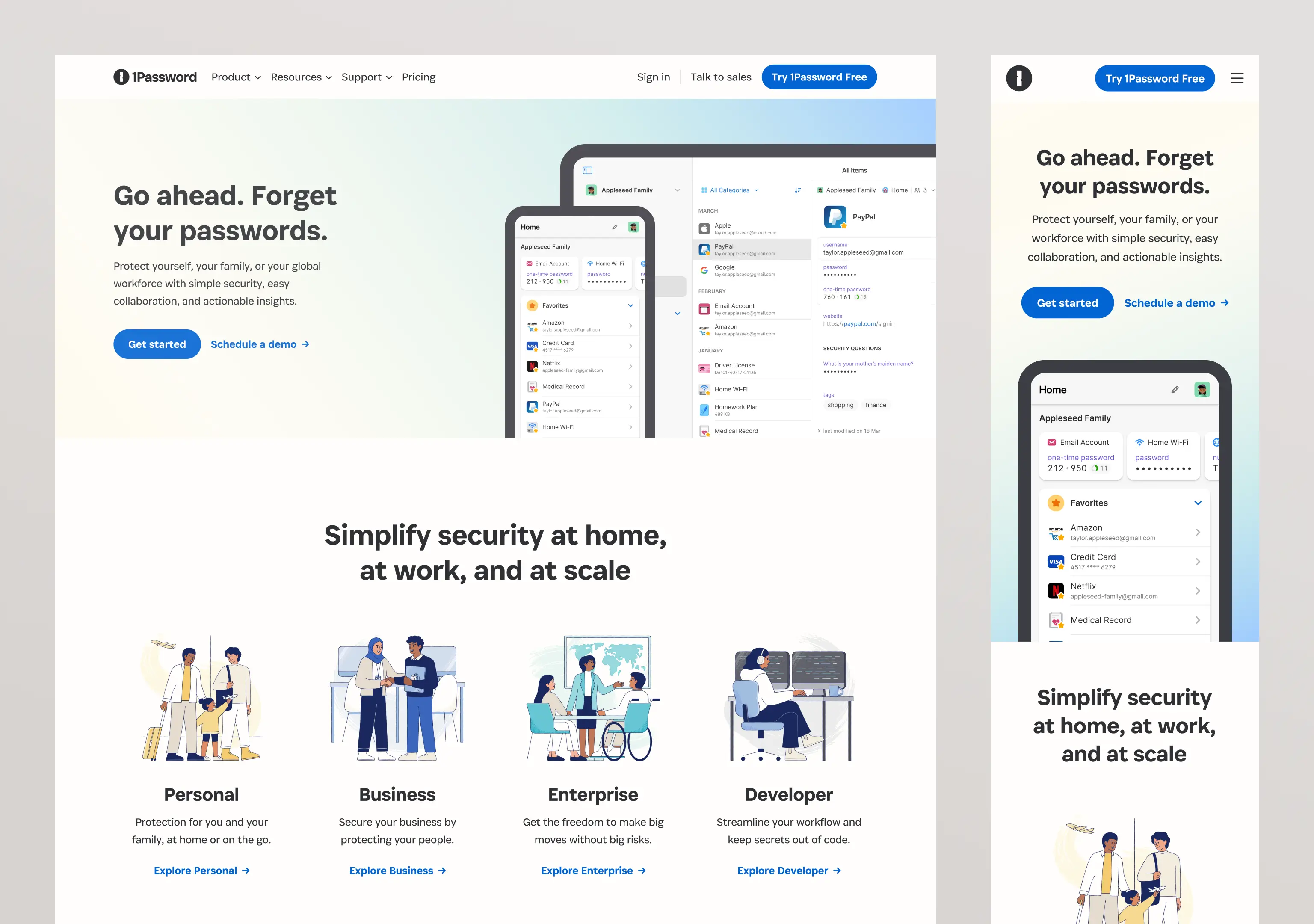
I partnered with teams across brand, content, engineering, and marketing to rebuild the website from the ground up. We redesigned pages that spoke directly to B2C, B2B, enterprise, and developer audiences with audience specific messaging and visuals that built credibility with buyers. I also redesigned the navigation and information architecture by grouping relevant content together and simplifying choices making it easier for different audiences to find what they needed. To ensure this work could scale, I built a component library that transformed how the team operated which allowed the marketing team to launch pages faster while ensuring each one told the right story for its audience.
- Senior Web Designer
- Design Systems
- Web Design
- User Experience
- Series C
- Security
- 2023 to 2024
- B2C / B2B
- Enterprise
- Developer
Impact from the web refresh project
80%
gain in design efficiency by creating a Figma component library that was built in Contentful giving teams a faster way to build and maintain pages.
48%
more sales form submissions after adding a persistent “Talk to Sales” link to the top level navigation and redesigning the contact page to reduce friction.
20%
boost in B2B account sign ups after designing audience specific pages for business, enterprise, and developer segments with tailored messaging.

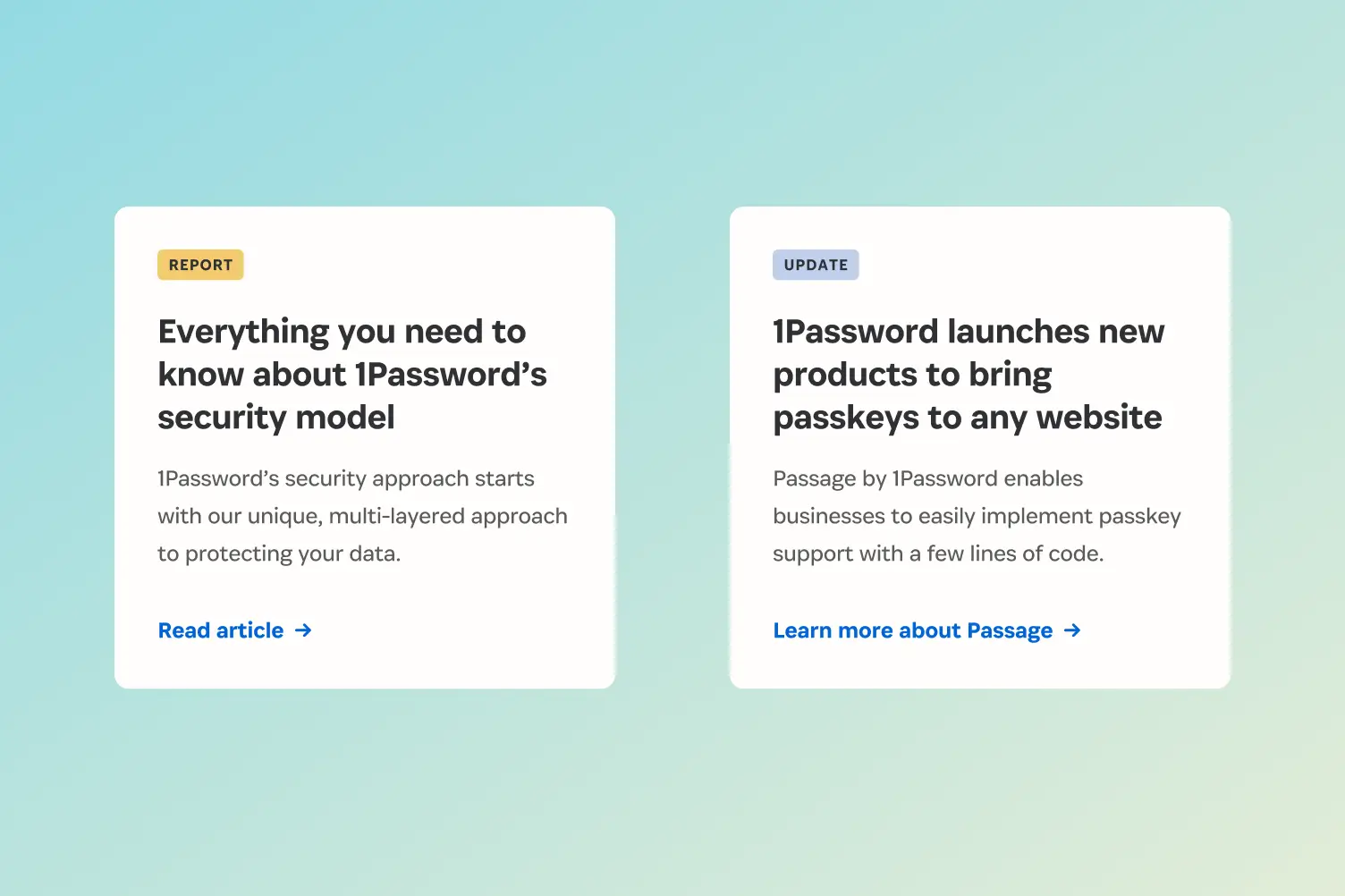
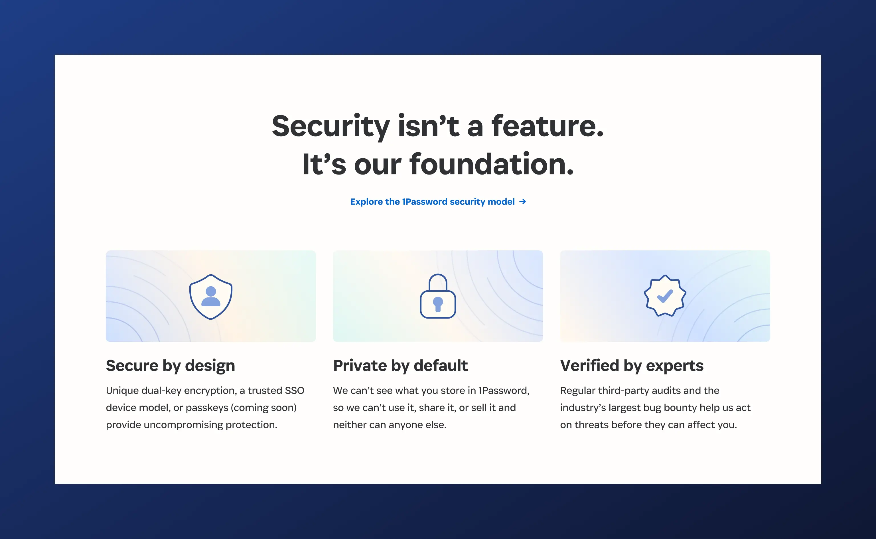
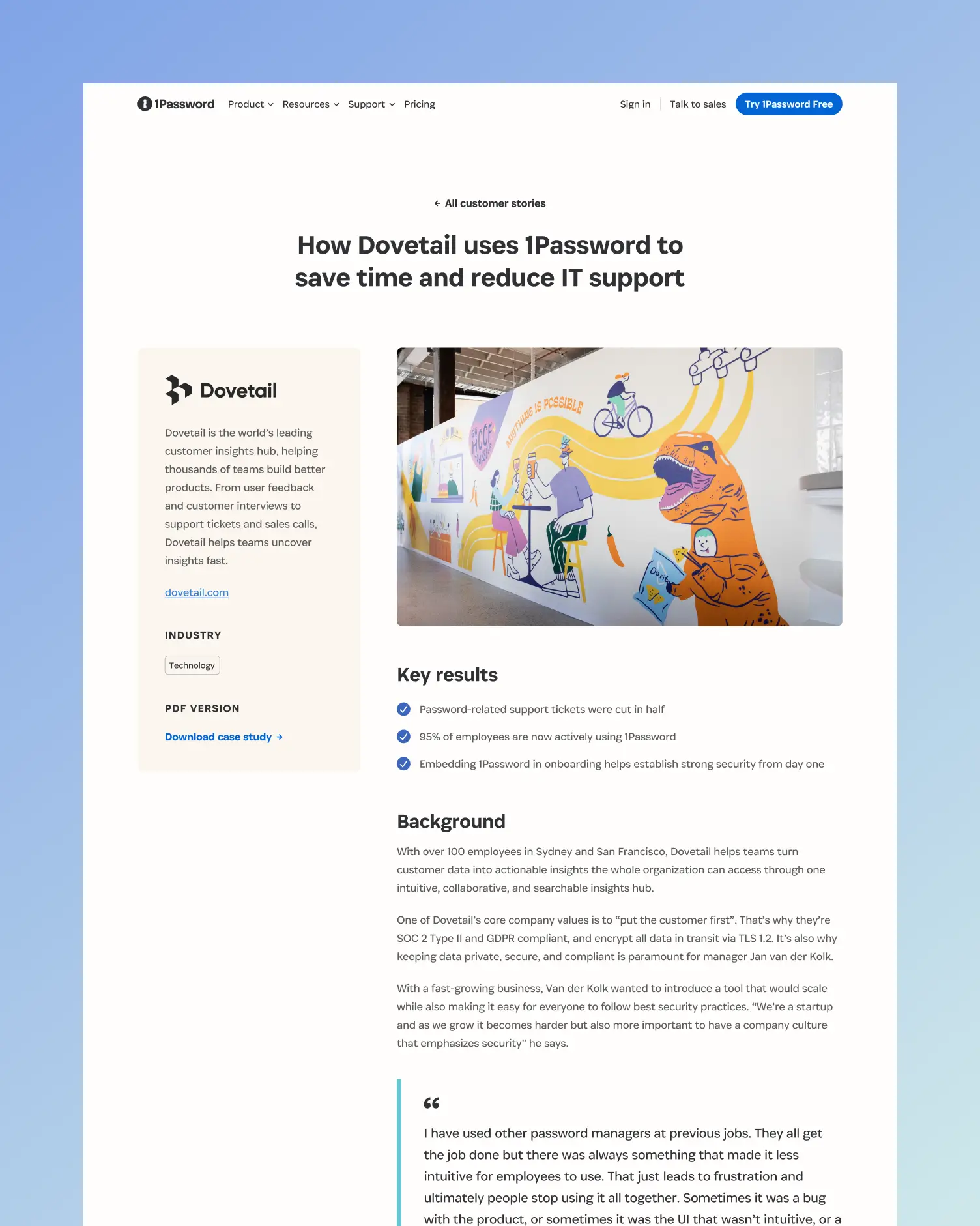
Building enterprise credibility while keeping the appeal for consumers
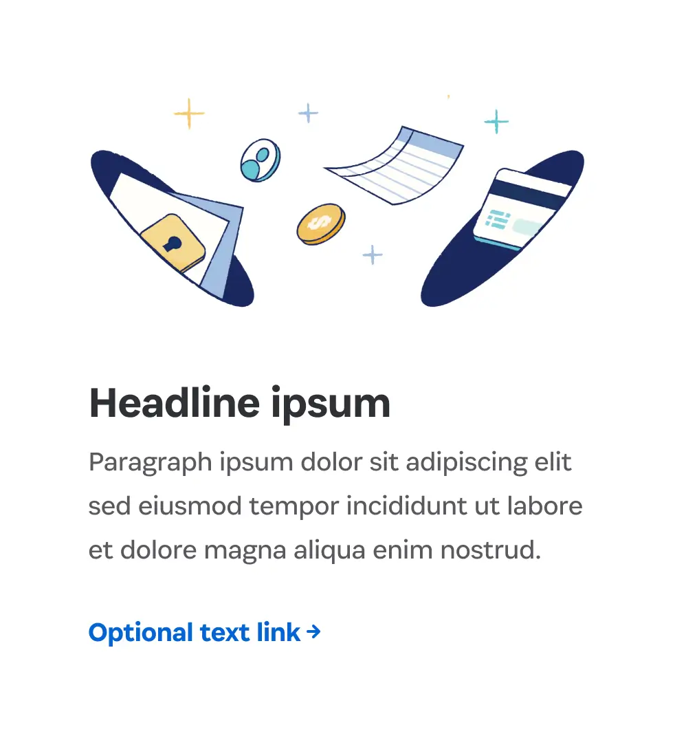
The website lacked the credibility signals business buyers expect. There were no customer stories, limited testimonials, and no social proof that would build trust with decision makers. At the same time, different audiences couldn’t understand if 1Password was right for their needs. That’s why I worked across teams to create distinct experiences for B2C, B2B, enterprise, and developer audiences so each audience could find what was relevant to them. Business and enterprise pages featured customer case studies, testimonials, and reports while consumer pages stayed focused on ease of use.
How we approached each audience:
- Maintain consistent brand elements while varying messaging for each audience
- Design new components to promote relevant resources and customer stories
- Improve navigation so visitors can find what's relevant to them
- Create separate audience pages addressing distinct pain points
- Use real product screenshots with contextual information


“Johnny builds with scale in mind, designing solutions that anticipate what’s coming next. He has a rare ability to spot hidden requirements early, which means fewer surprises downstream and more resilient, long lasting solutions.”

Patricia Mewdell
Creative Strategist, 1Password

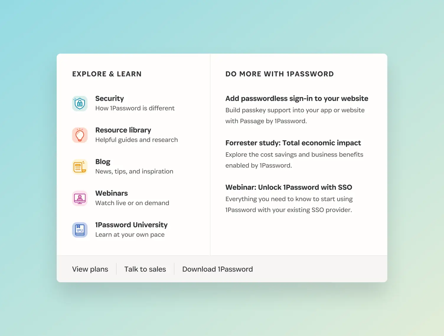
Simplifying the navigation to reduce friction
The navigation was cluttered with too many options. Critical user flows like contacting sales were missing, making it hard for users to find what they needed. I researched how leading SaaS companies structured their navigation, then created a new version to prioritize user needs first while still creating space for the marketing team to promote resources and webinars. I designed a hierarchy that surfaced the most important information immediately while keeping promotional content out of the way. This made it easier for visitors to take action, whether that was starting a trial, contacting sales, or exploring specific use cases.
My approach to the navigation redesign:
- Organize navigation items into logical groups that matched how users think
- Add prominent “Talk to sales” CTA to support enterprise sales conversations
- Create room for promotional content while prioritizing what users need first


Creating a foundation for sustainable growth
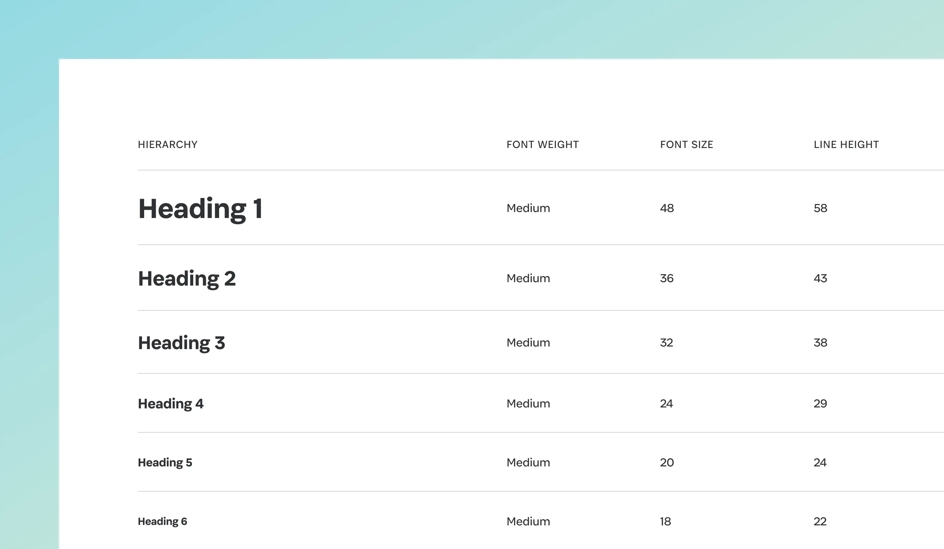
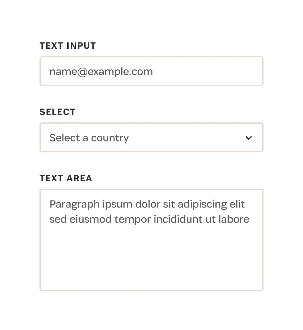
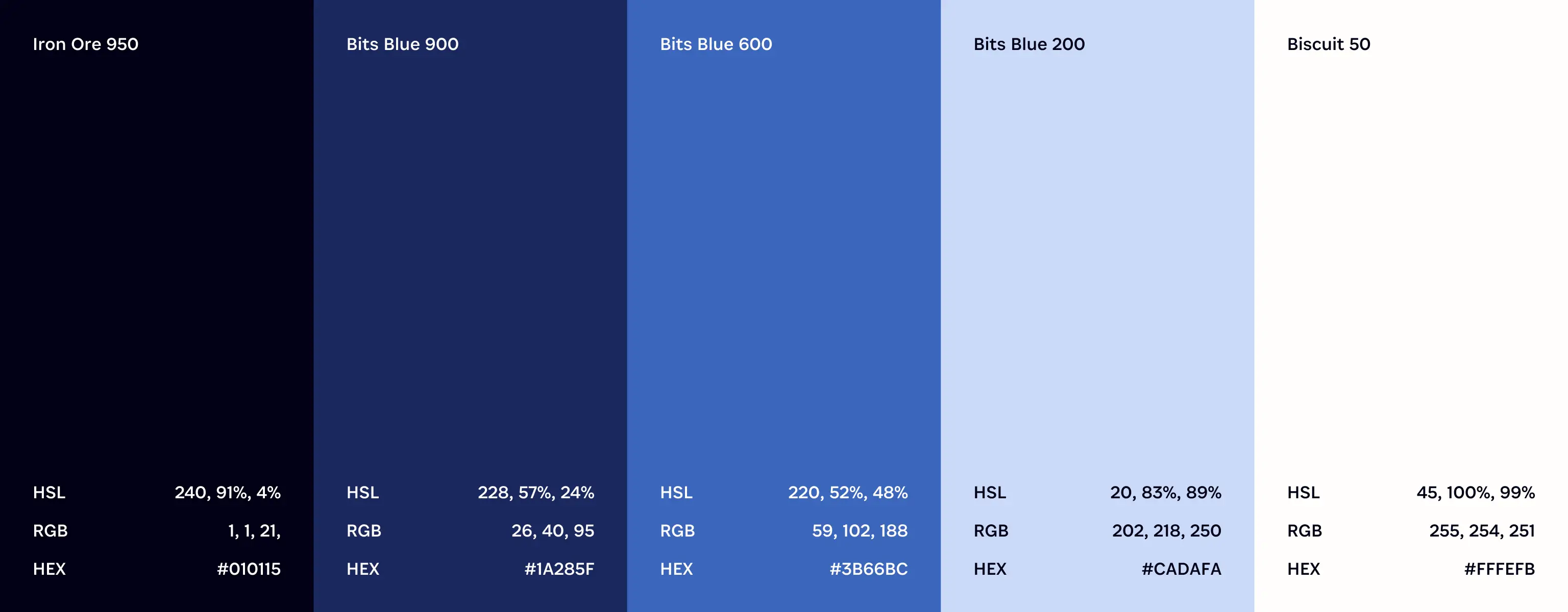
Designers were creating the same elements over and over again, while developers were rebuilding them in code for every new page. Without a unified system, both design and development teams struggled to keep up with the volume of work needed to support the business. That’s why I built a Figma component library designed to work across multiple languages and device sizes with full CMS documentation that explained functionality for designers, developers, writers, and content authors. Working alongside the web development team, I ensured every component could be built once and reused across the site, and that the CMS experience was intuitive for non-technical team members. The library transformed how the team worked, making it faster to launch pages while maintaining consistent quality across the marketing site.
How I built the system:
- Built 65+ components that eliminated recreating elements from scratch
- Designed an accessible and responsive foundation supporting 11 languages
- Created documentation so non-technical team members could build pages


Credits
Interactive
- Alvina Fung, Web Designer
- Johnny Jakubowicz, Senior Web Designer
- Patricia Mewdell, Creative Strategist
Brand
- Grace Kim, Senior Illustrator
- Jon Setzen, Creative Director
- Lawren Ussrey, Art Director
Motion
- Pete Knowles, Senior Motion Designer
- Spencer Lalonde, Senior Motion Designer
Development
- Andy Hill, Senior Web Developer
- Ashish Grover, Engineering Manager
- Bianca Procopio, Web Developer
- Harun Sheikhali, Web Developer
- Jen Philp-Zakic, Senior Web Developer
Content
- Marius Masalar, Senior Content Strategist
- Rob Boone, Content Marketing Manager